UX DESIGN | UI DESIGN | DEV
Anahuac Mayab
University
Anáhuac Mayab University is a top private institution located in Mérida, Mexico. As the most prestigious university in the city, with over 4,000 students, it plays a key role in the Anáhuac University Network, the second most significant university network in Latin America.
TL;DR
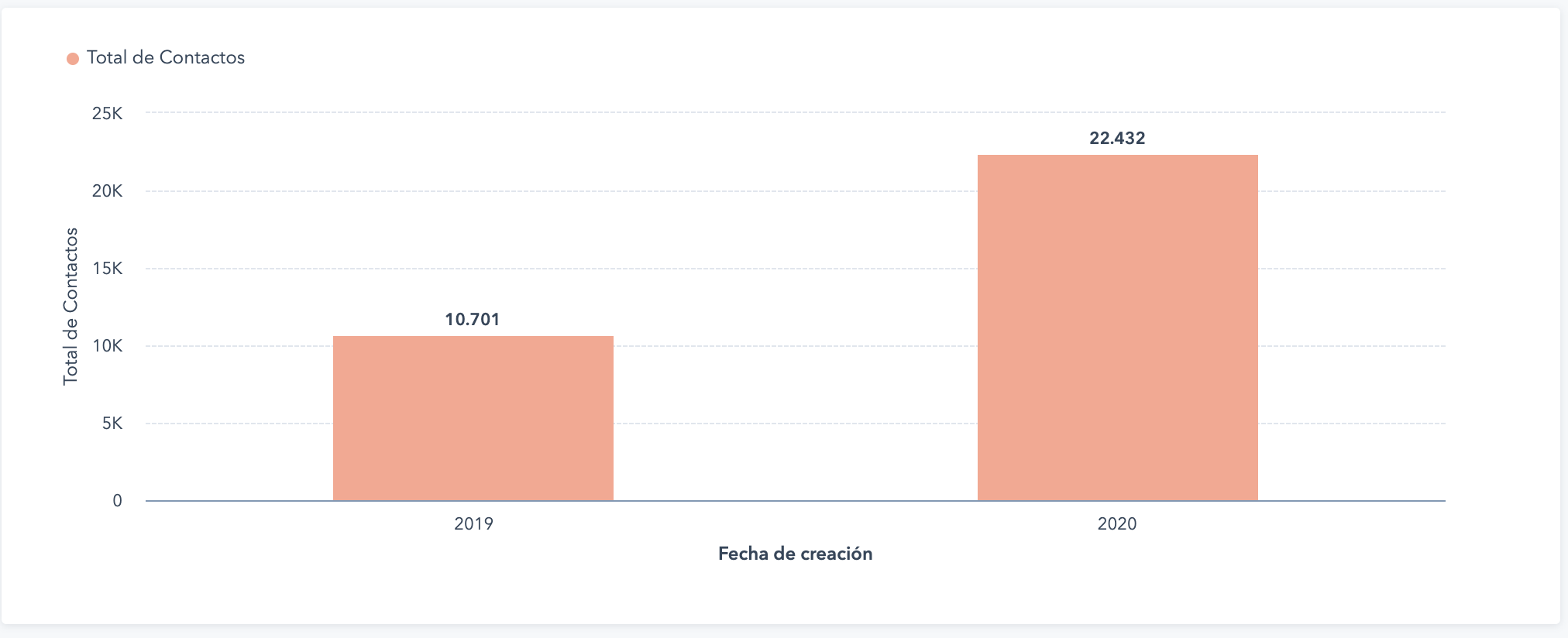
Improved Information Architecture, helped increase direct traffic by 89.42 %, and contact creation increased by 209.67%, saved uncountable hours of manual work and improved brand consistency.
Had enough case studies? Skip to the fun stuff! 🌟The problem
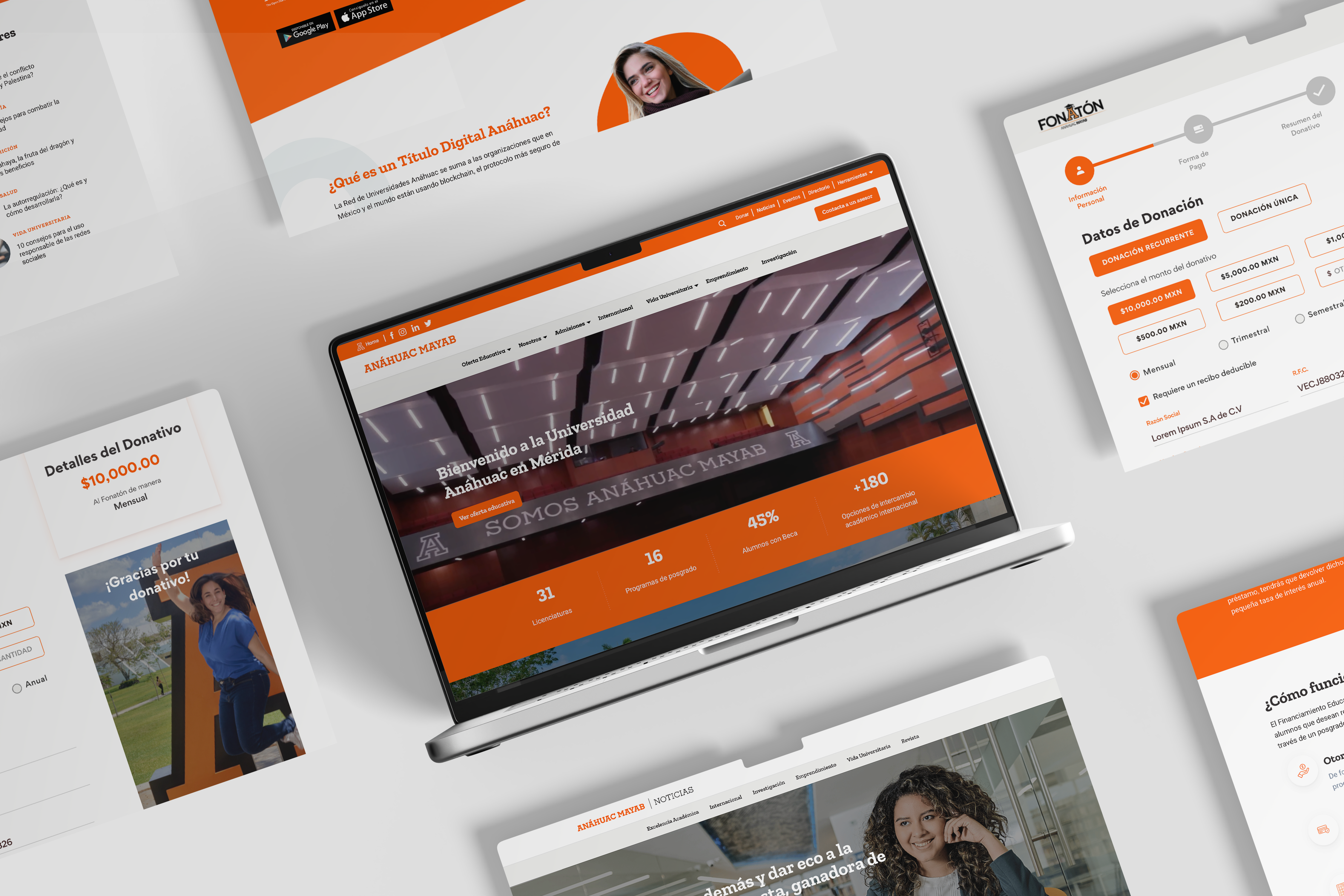
When I started working as a UI/UX Designer and Developer, a few things stood out right away: brand assets were being used inconsistently, students were frustrated with how hard it was to navigate the site, and the absence of a search function wasn’t helping anyone. The website didn’t follow brand guidelines either—colors, fonts, and components were all over the place, which only made things messier.
The Solution
Information Architecture
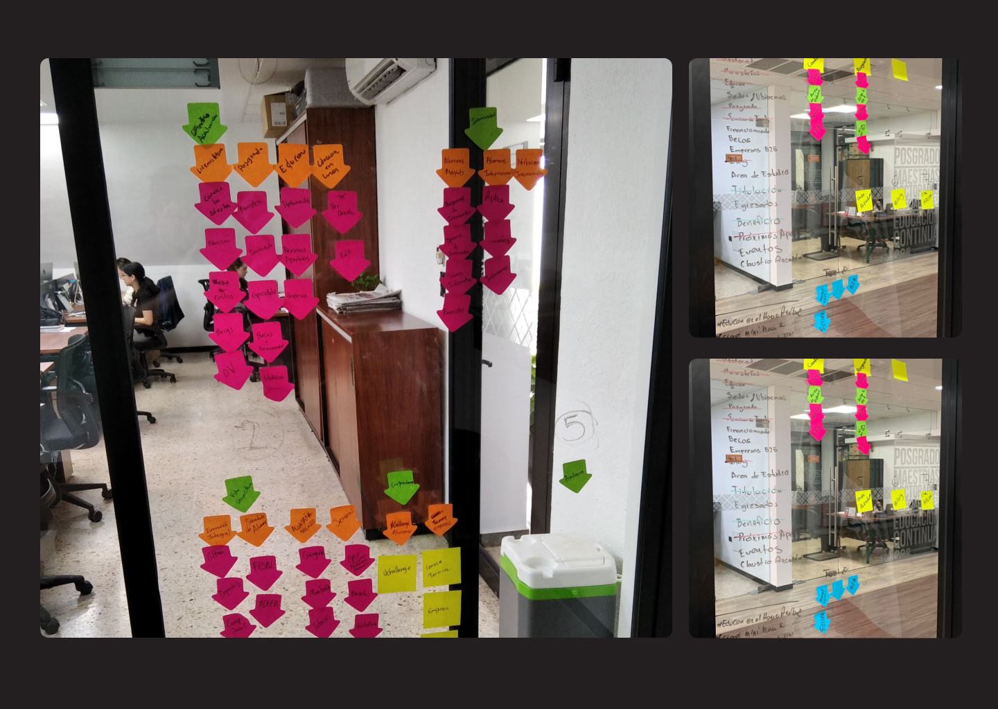
To get the site’s structure right, the first thing I noticed was that the navigation felt more like it was designed for the organization’s internal processes than for the students who actually used it. Through card sorting exercises, we reorganized everything from the ground up. This led to a much cleaner, more intuitive site structure that made sense to the students—not just the admin.
Card Sorting
We used card sorting to run tests with both students and employees, giving us real insight into how different groups perceived the University’s structure and entities. Their feedback helped us redesign the navigation to reflect how users actually think, rather than just how the organization was set up internally.
Sitemap
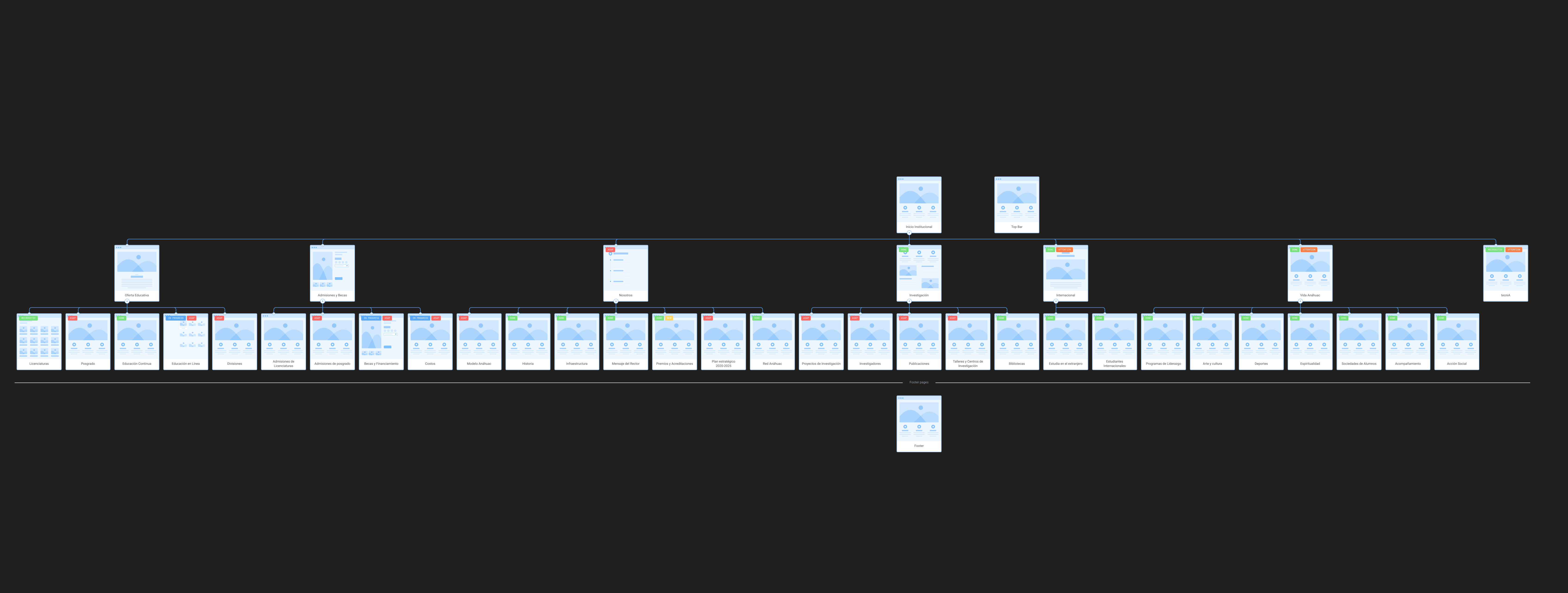
For building the new sitemap, we leveraged Flowmapp to design and gather feedback. It made collaboration with stakeholders easy, allowing them to leave comments directly on the sitemap. This feedback loop was crucial in ensuring the structure worked for everyone involved
User Interviews
Conducted in-depth interviews with students and employees to dig deeper into their needs and frustrations. Listening to their stories gave us a better understanding of how they engaged with the site ensuring the new experience met their needs.
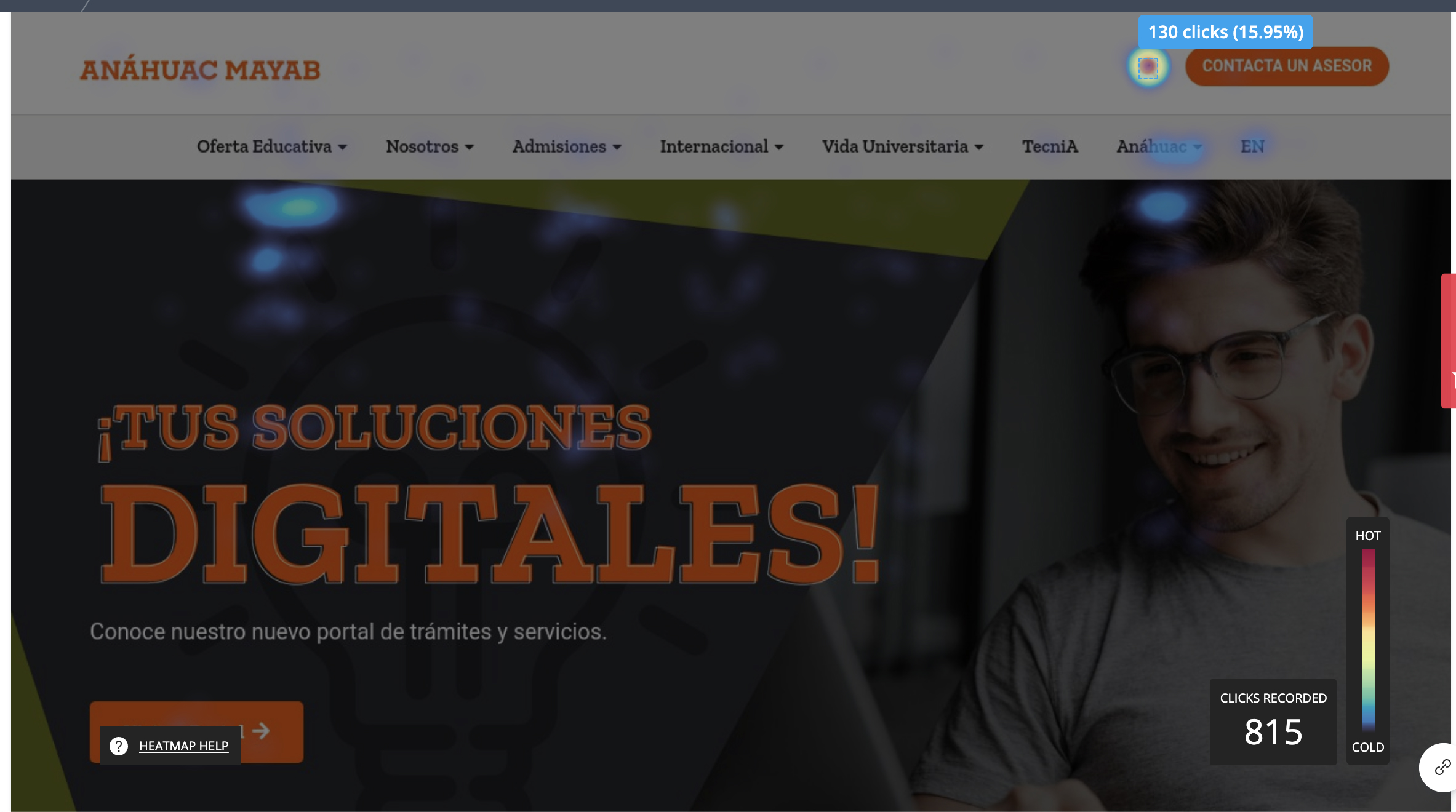
One of the first things I tackled was the missing site search. As soon as I implemented it, visitors started using it heavily, often more than the main navigation. But after redesigning the Information Architecture to make things easier to find, the reliance on search dropped a bit. Even with the smoother navigation, the search is still one of the most popular features on the site, which makes sense given its usefulness in a site of that scale.
Design System
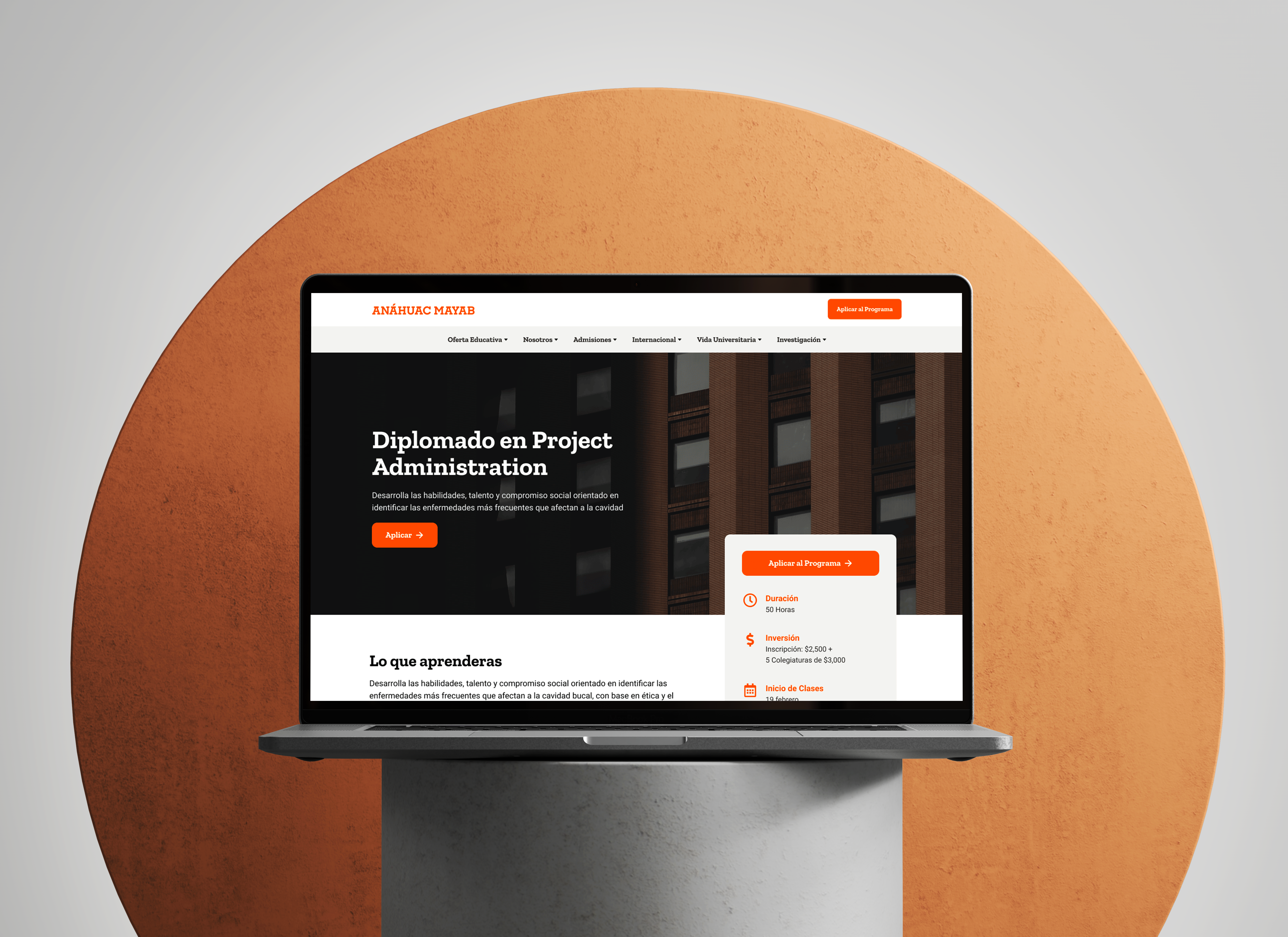
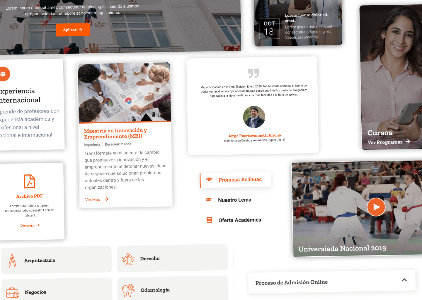
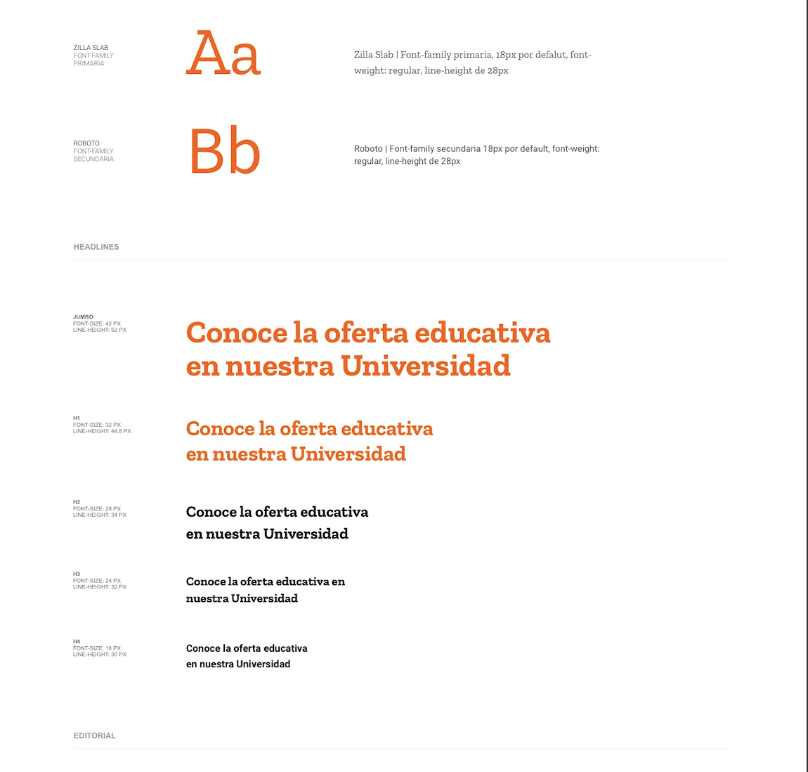
A key issue I noticed early on was the lack of brand consistency across the site. Content editors were using various components in different ways for the same tasks, which led to confusion and frequent mistakes. These components were too flexible, giving users too many options and no clear direction. Despite a recent rebranding—complete with new colors, typography, and an illustration system—there were no digital guidelines to maintain consistency.
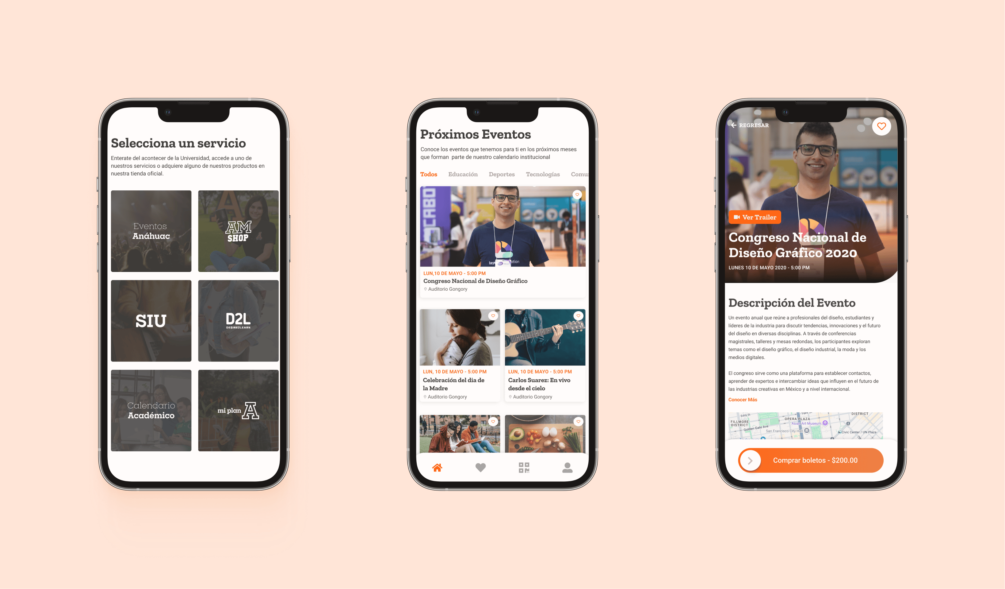
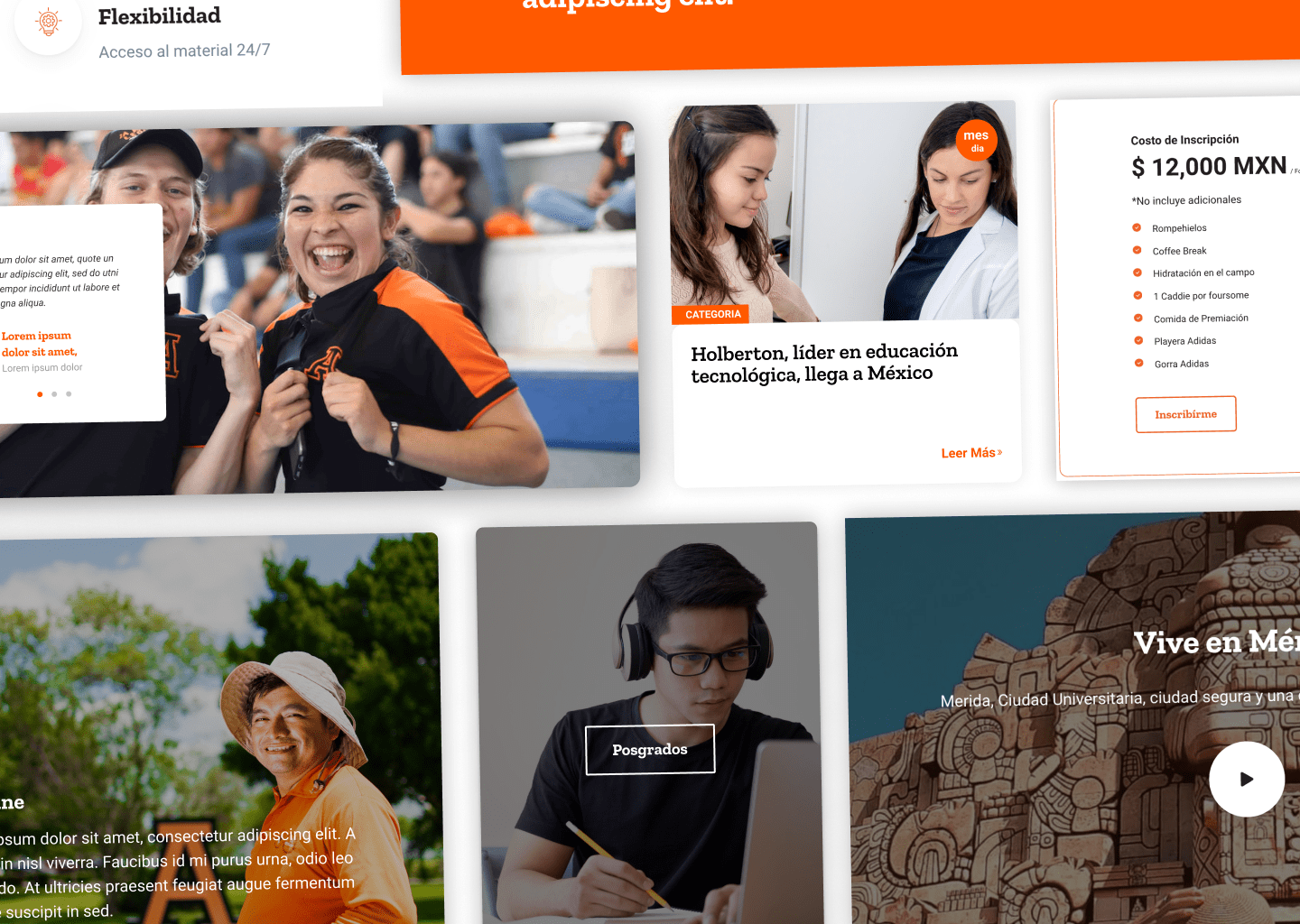
II began designing and prototyping new components in Figma, which I then coded as reusable modules in Hubspot CMS. Initially, management questioned why I was spending additional time on what seemed like simple tasks. I pitched the idea of developing a design system to solve these issues long-term, but since they weren’t familiar with the concept, there was some hesitation. However, after a few months, the team began to see the value as reusable components saved time and improved the site's overall consistency.
Within the first four months, I had created over 25 reusable components. The benefits were clear, and as a result, I was put in charge of leading a team of two designers and a developer to expand the system. I led this team for a few months before moving on, and since then, the project has grown so much that they’re considering a unified design system for the entire university network.
Automation
When I joined the team the process of updating everything was done manually, for example; if a program or an event appeared on 5 different website pages they would go and spend hours and hours and this led to a lot of pages with outdated information.
With the help of the relational data storage system in Hubspot CMS (HubDB) I created some tables that could help us to be a single source of truth and by just updating here it would update in every single instance where this data was displayed, saving the company of hours and hours of manual work.
Results
The year after we began implementing these changes, these changes helped increase the following KPI's. Direct traffic increased by 89.42 %, and contact creation increased by 209.67%
